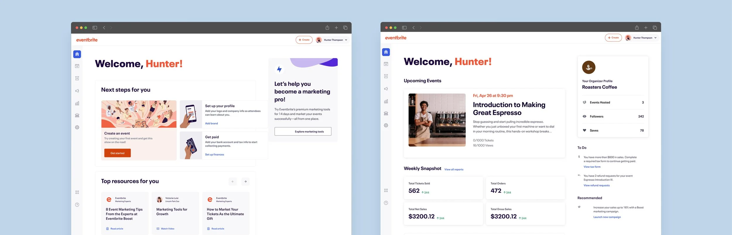
Eventbrite: Creator Home
When creators landed on Eventbrite, they faced a frustrating guessing game. Brand new creators lacked a clear roadmap for setting up their accounts and events. Even after publishing for the first time, they often missed crucial steps like setting up payouts or discovering marketing tools like Boost. On top of that, creators had no easy way to check the real-time health of their events, which led to unnecessary support tickets and missed potential. Operating on a tight H2 2022 timeline, I led product design to bring everything into a single, consolidated workspace. By giving creators a clear view of their event health and surfacing the right actions at the exact right moment, we turned a fragmented experience into a guided path that drove meaningful growth.
My role: Product Design Lead
Context: Dual-Sided Marketplace Optimization
Duration: 1 Month (MVP) + Rapid Optimization Iterations
Impact: Boost Subscription Adoptions: +30% | First Paid Event Publishes: +18%
The Whole Picture
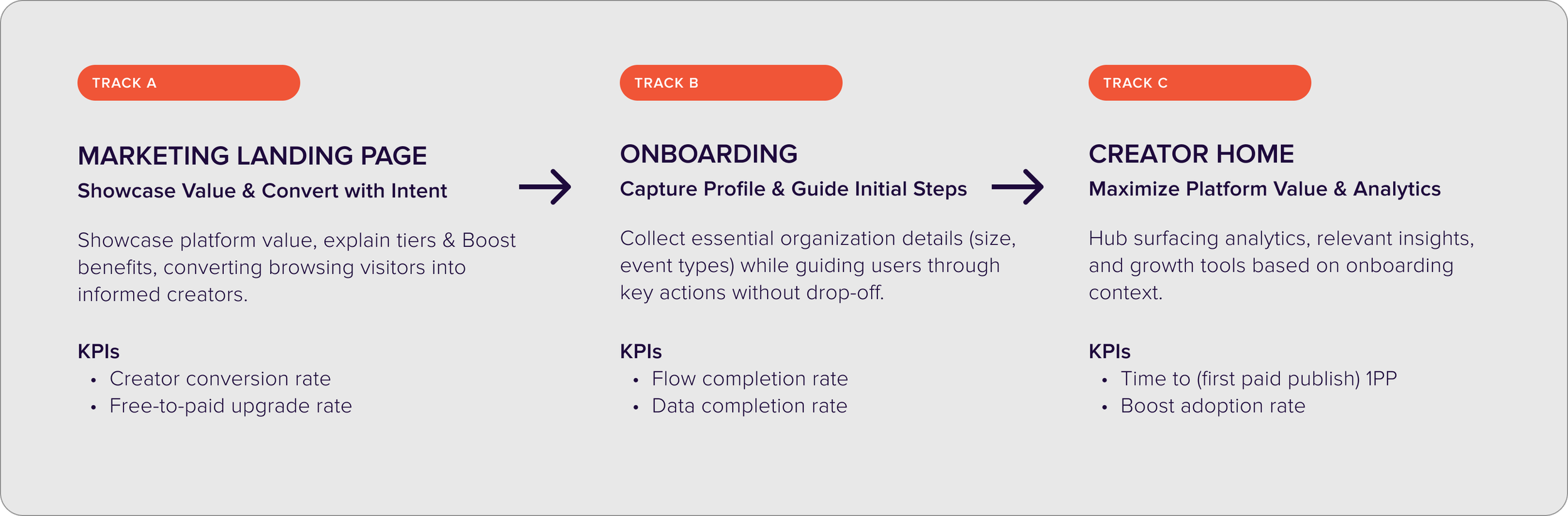
Creator Home was not a standalone feature. It served as the central hub of a broader growth initiative that included two other critical tracks: the marketing landing page and the onboarding flow. The catalyst for these changes stemmed from Eventbrite recently launching restructured membership pricing tiers and optional paid marketing tools (named. “Boost”).
While individual teams focused on designing those specific experiences, I provided the overarching design direction and cross-functional oversight. My role was to align all three work streams into a single platform narrative so the entire journey felt intuitive from the moment a creator logged in.
Aligning Business Goals with Creator Needs
Heading into the second half of 2022, Eventbrite’s primary objective was to get more active creators hosting events on the platform. When we dug into the funnel data and user behavior analytics, we found two massive friction points blocking us:
Subscription Confusion: New creators couldn't figure out which paid tier actually matched the size of their event.
Hidden Value: Users who signed up for free trials were completely missing Boost (our suite of marketing tools) due to the tools being buried in a separate area of the site, outside their natural event-creation workflow.
To balance our growth targets with real user value, I put together a shared alignment document to get all stakeholders on the same page. I translated raw business requirements into clear human problem statements, focusing on how we could provide automated guidance and make it much easier to get an event live.
Looking at the three connected tracks of work, I partnered directly with each PM to align PRDs, KPIs, and problem statements around a single, connected user journey. By co-authoring documentation, we eliminated contradictory goals between acquisition marketing and core product retention.
Discovery & Insights
Show You Listened
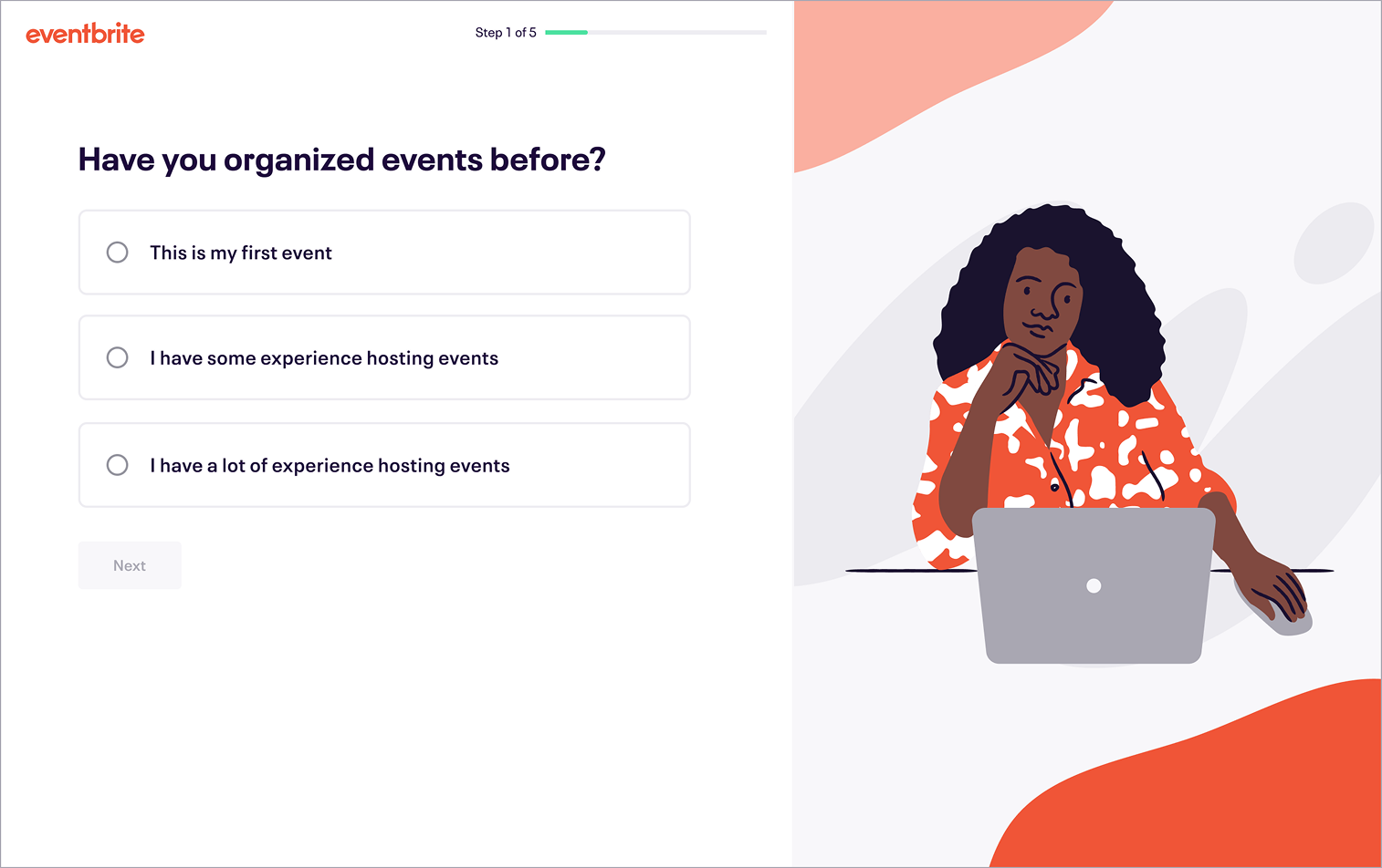
Never make users re-enter information the system already knows. Choices should be reflected into the UI, demonstrating EB’s active attention.
Because our timeline was incredibly compressed, we didn’t have the luxury of running fresh, weeks-long user interview cycles. Instead, I established a rapid discovery phase by piecing together what we already knew. We dug into previous research reports, analyzed recent funnel metrics, and ran a comprehensive competitive/comparative audit to understand how modern creators expected to engage with modern platforms. Through affinity mapping out uncovered patterns, I grouped these insights into three core design pillars with sub themes for each track of work:
Kick-off Workshop
To get everyone moving in the same direction, I ran a cross-functional alignment workshop for our product, engineering, and marketing leadership and teams. Gathering everyone into one collaborative “room” (you know it was Figjam) early on was essential. It allowed us to voice technical constraints, hash out product requirements, and lock in a shared direction before we spent time exploring designs.
Emergent Design Principles:
Designing for Two Very Different Users
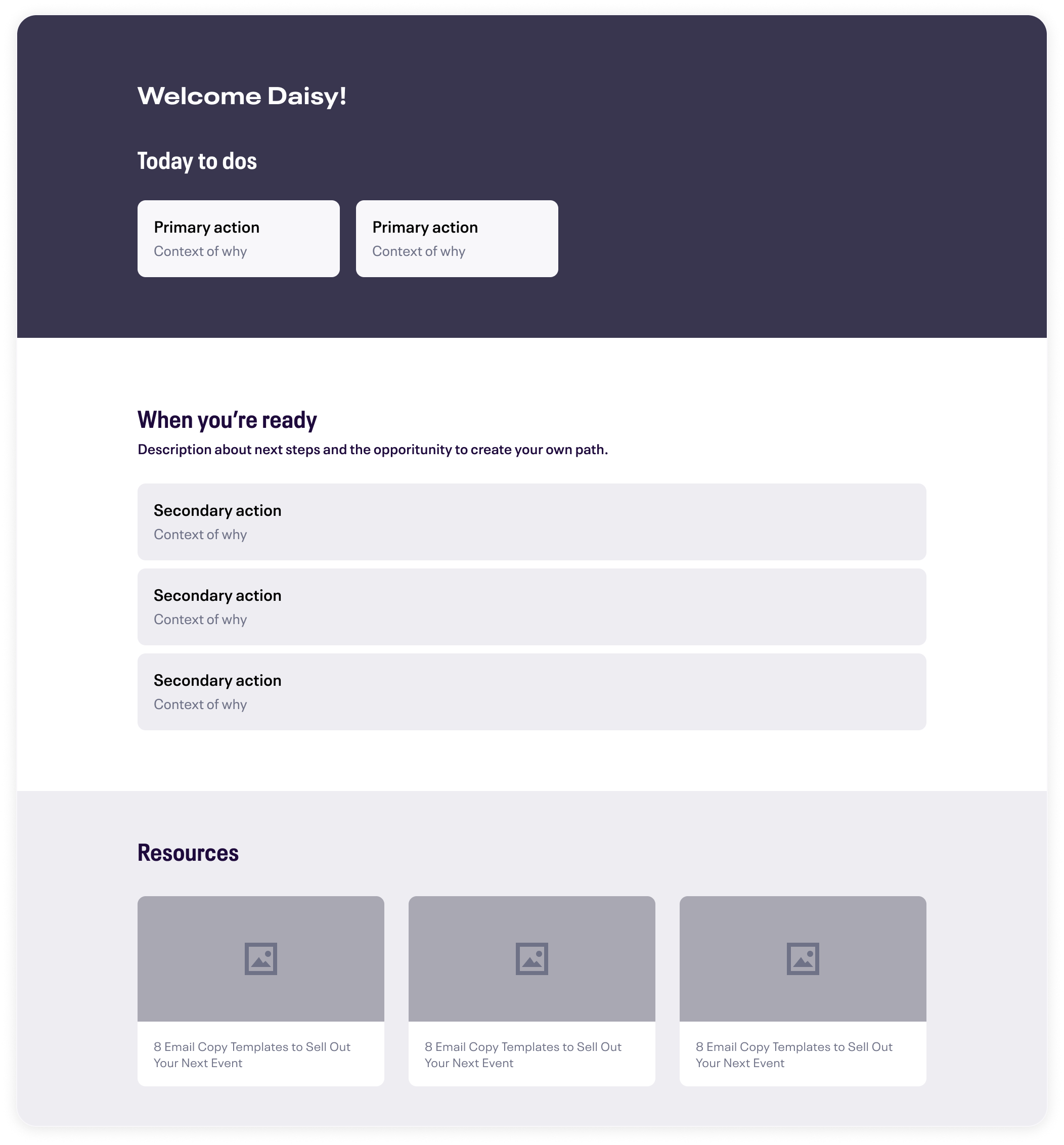
Once we had alignment, I jumped into rapid wireframing and layout exploration. I anchored the design around a modular card layout because we needed a single interface that could gracefully serve two entirely different user profiles:
The Novice Creator: Needed clear instructions to guide them through successful initial milestones setup without making them feel overwhelmed.
The Power User: Wanted to skip the basics entirely and instantly see deep event metrics, live conversion data, and feature shortcuts.
A Dynamic Home via Onboarding Signals
Page Content
Beyond the core setup tools, we also needed to figure out where to put educational resources like how-to guides, platform tips, and creator spotlights. The trap here was turning the dashboard into a messy blog feed. We focused on treating this content as a supportive secondary layer by positioning it beneath the main action items so creators could easily find resources to scale their events without it cluttering their primary workspace.

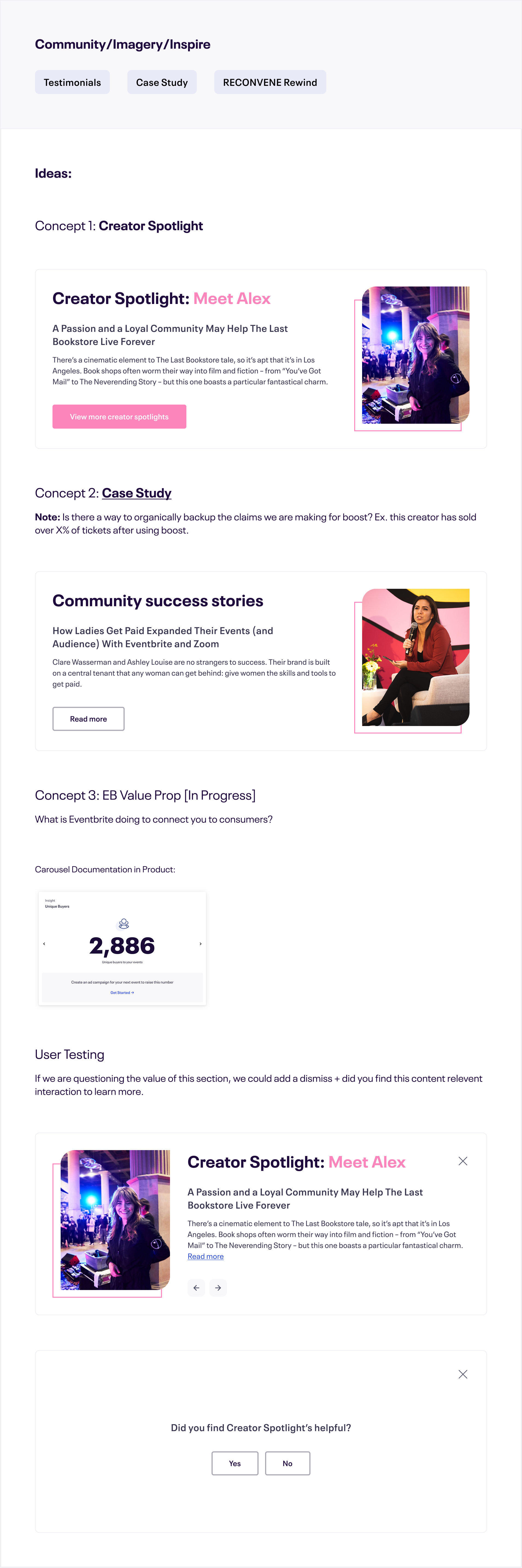
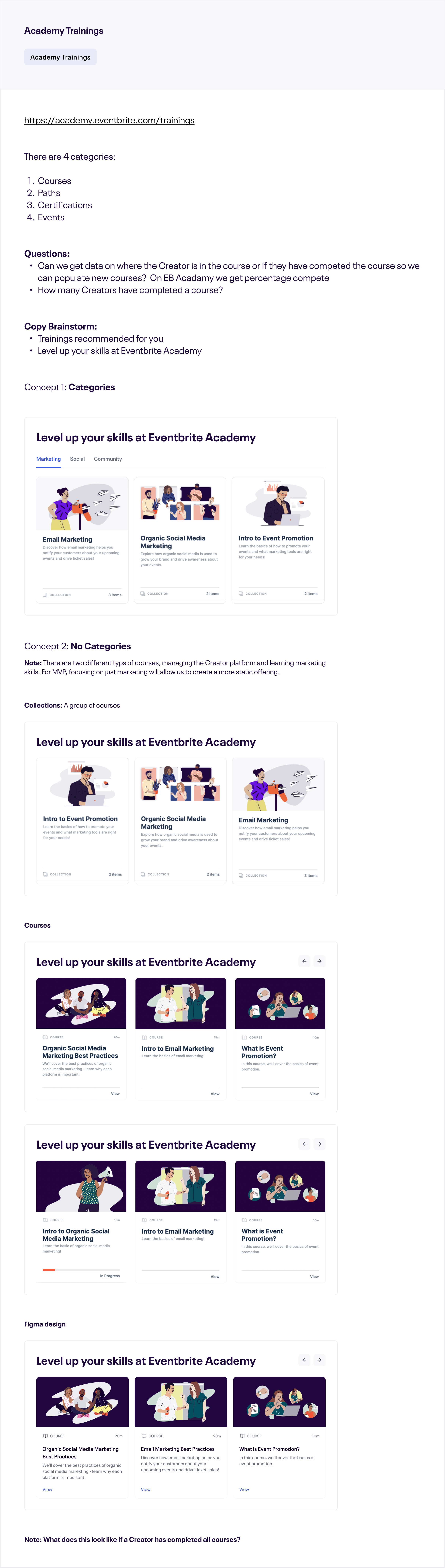
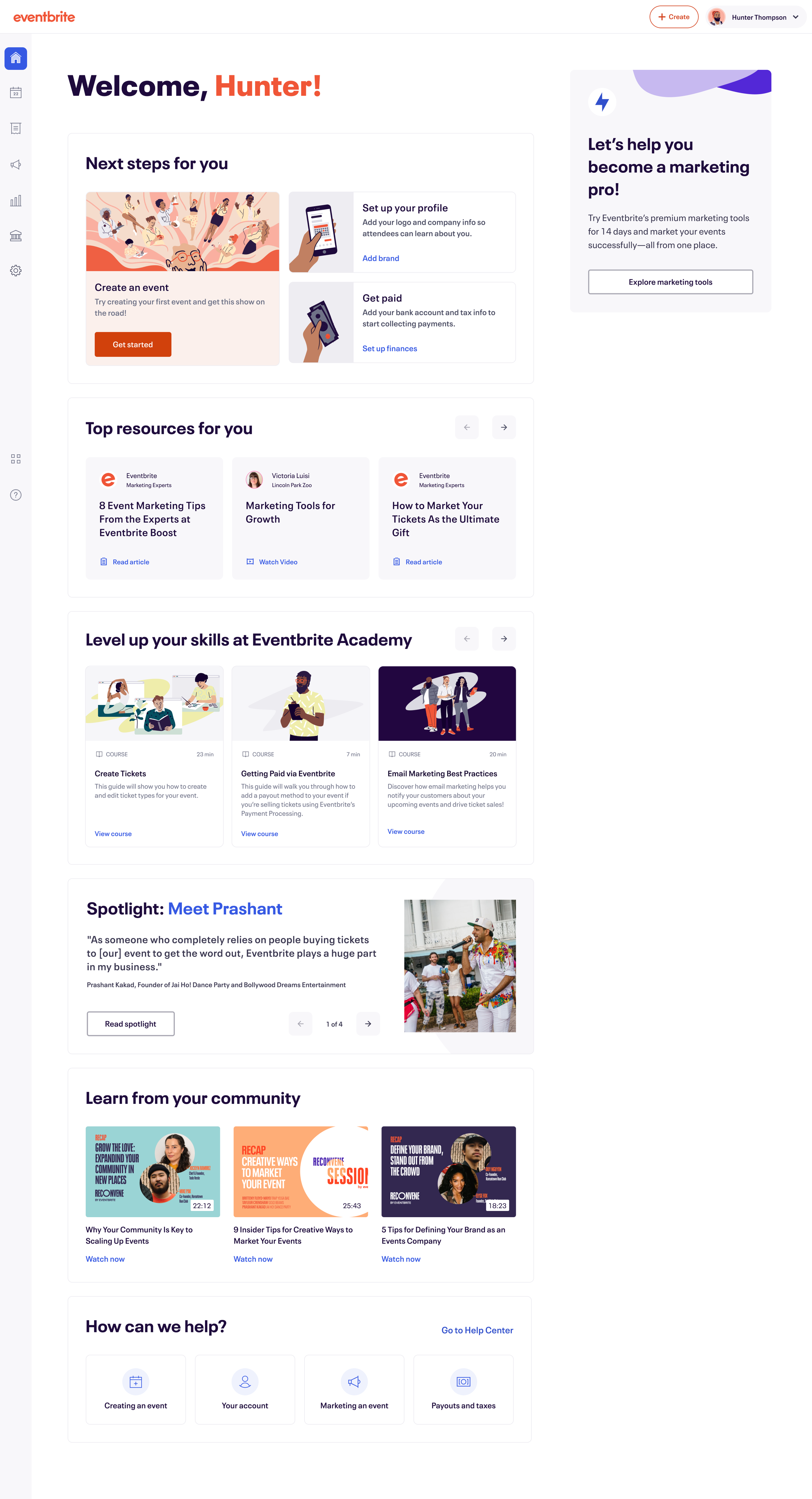
Initial explorations focused on creating a personal, dynamic homepage for creators coming out of onboarding. I tested multiple layouts to ensure the page reflected the context we gathered during signup. Different combinations of educational resources, academy trainings, and growth inspiration tailored to their goals were all explored, along with surfacing critical setup tasks clearly.
States and Details
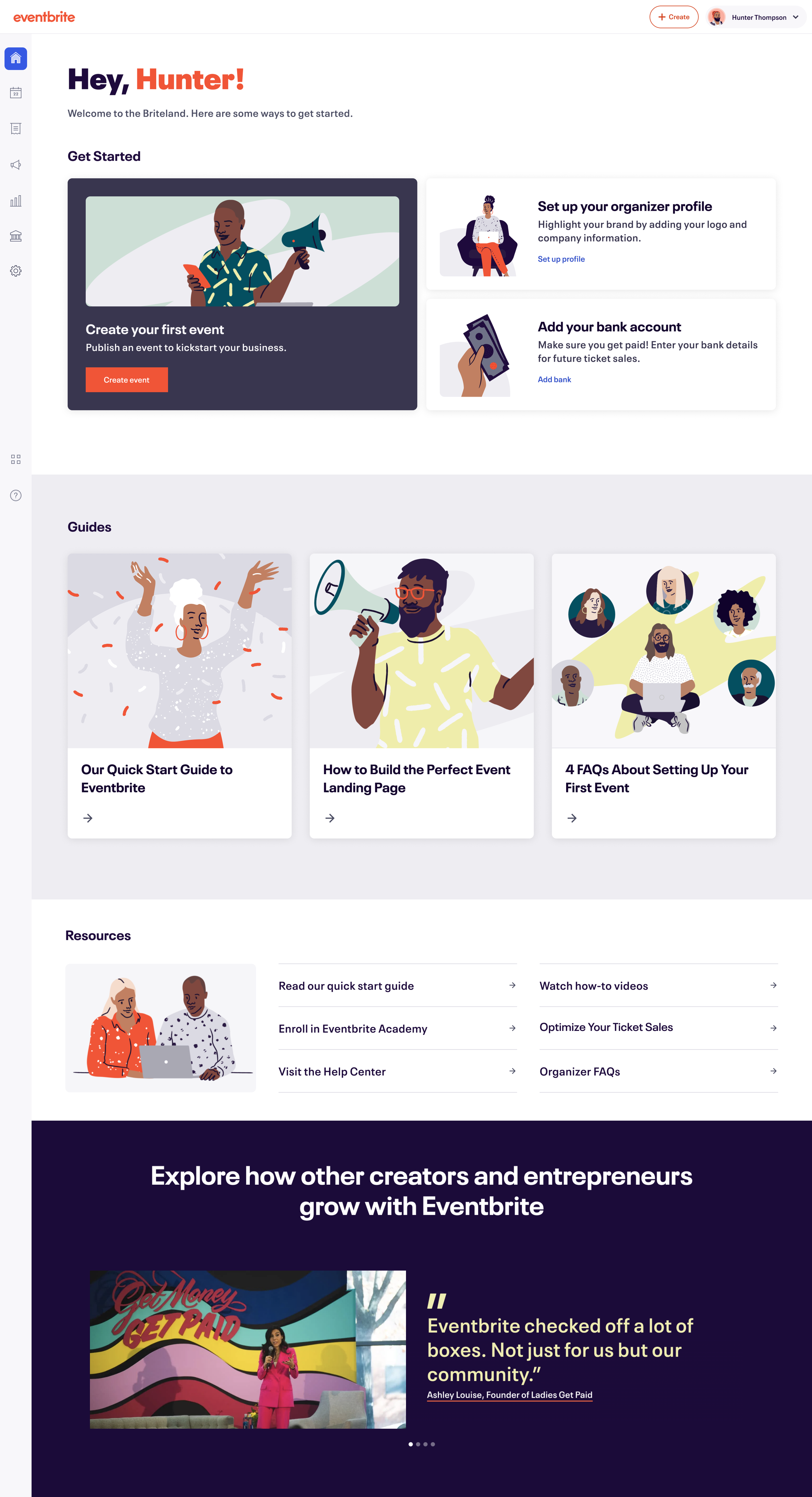
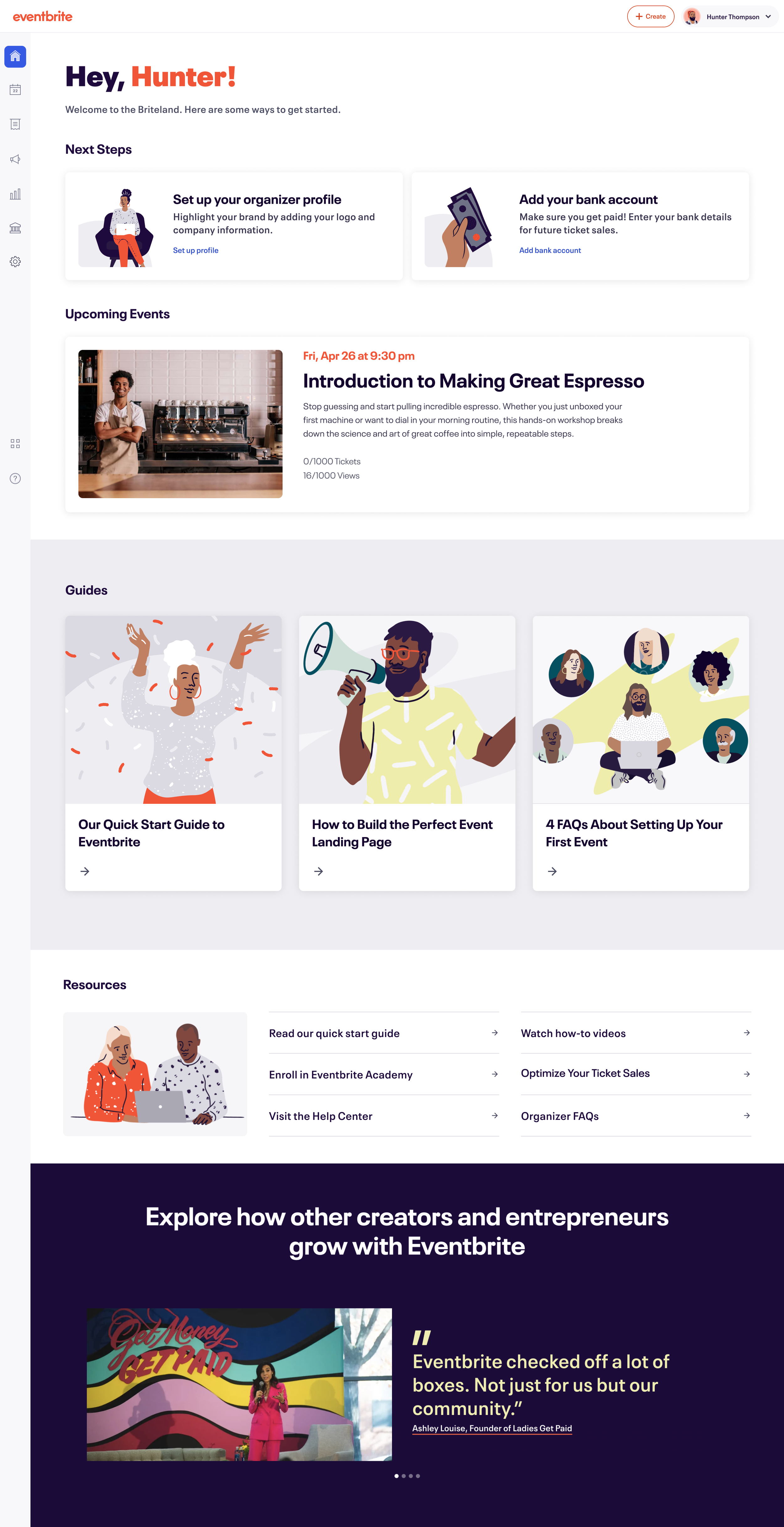
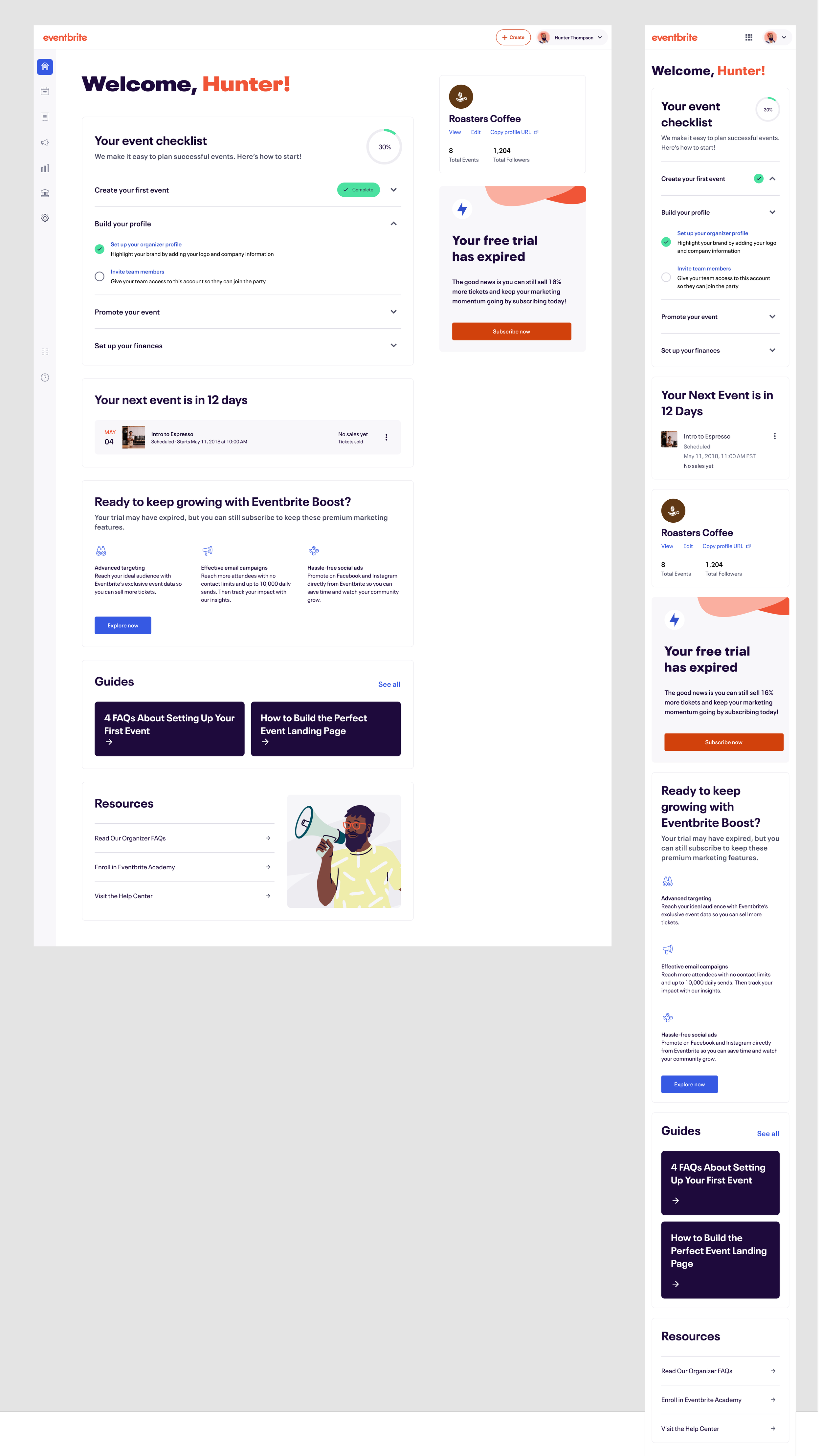
Midway through the project, our timeline was cut in half. Eventbrite’s biggest signup spike of the year happens in September, so missing that launch window wasn't an option. I collaborated directly with leadership and engineering to pivot, scaling our complex card framework down into a streamlined, list-based MVP checklist. Stripping the layout down to this core checklist freed the engineering team to begin building the foundational architecture immediately, allowing us to work in tandem to meet the deadline. It wasn't the expansive dashboard we initially dreamed up, but it guaranteed we shipped a stable, high-value product right before our highest-traffic time of year.
Time Crunch
One Bite at a Time
Lean on progressive disclosure by breaking apart complex forms and dense setups into manageable, right-sized micro-steps so users are never overwhelmed all at once.
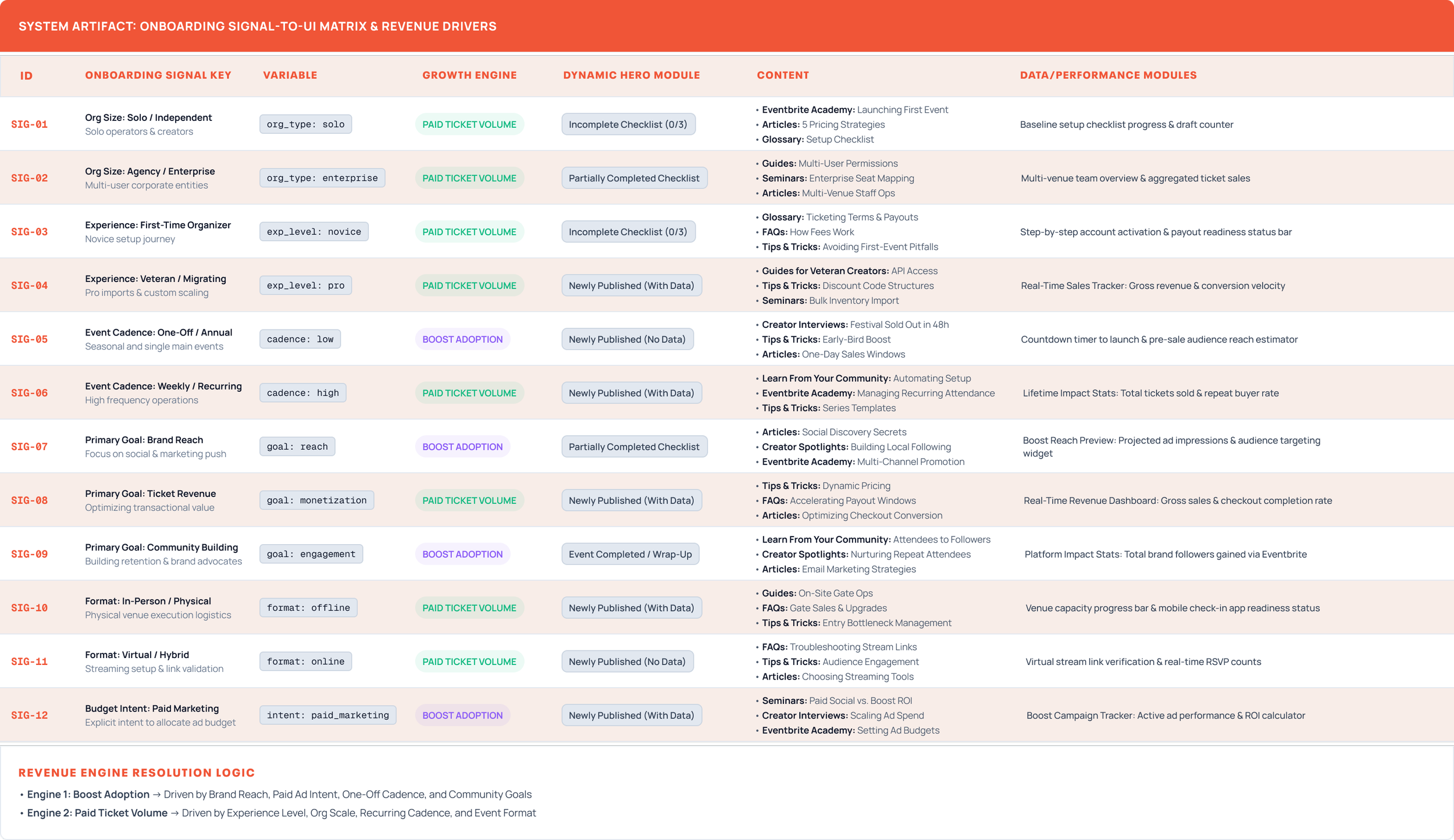
Rather than treating setup as an isolated linear funnel, I partnered directly with the Onboarding team to build a unified interaction matrix connecting initial user setup to the core workspace. By mapping 12 explicit setup signals directly into the underlying UI matrix for Creator Home, we ensured the initial interface state immediately reflected the creator's operational scale, goals, and monetization model. This system surfaced relevant growth engines, performance widgets, and educational pathways from day one.
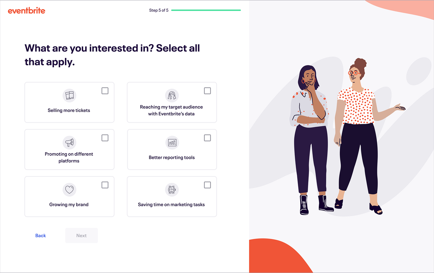
Final MVP Designs
Engineering Handoff
To eliminate any "lost in translation" friction between design and code, we brought our engineers into the process on day one. We reviewed component structure, layout logic, and edge cases together in parallel with my visual design refinement. Because of this continuous communication, the final handoff didn't involve chaotic, reactive explanation sessions. Instead, we delivered highly annotated Figma specs that led to an incredibly efficient build cycle.
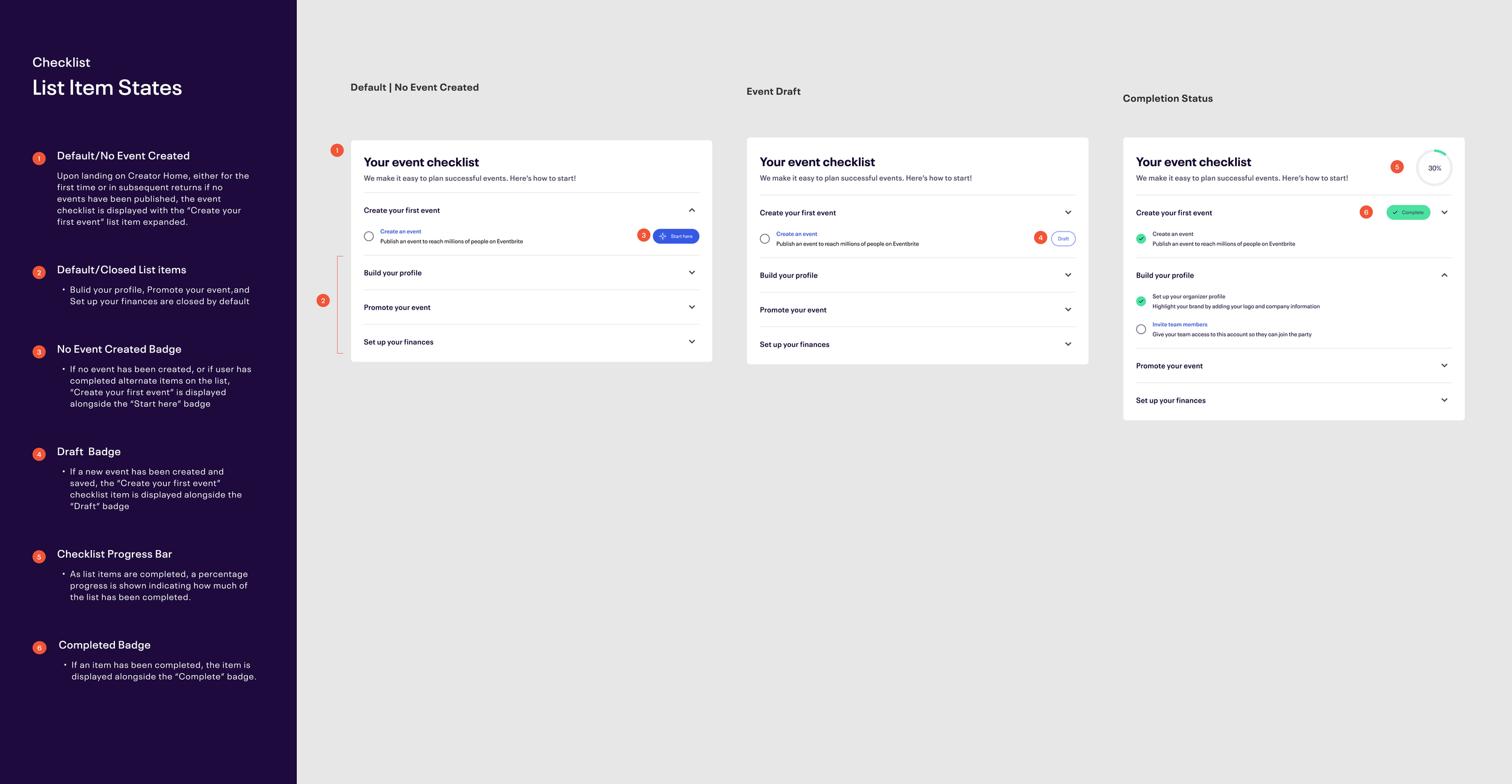
Huh. Well, that Didn’t Work.
We watched the live data roll in post-launch, waiting for the big win. Instead? Total radio silence. Turns out, that in an attempt to satisfy every single internal stakeholder’s request for placement in the checklist had resulted in a crammed the checklist with far too many tasks. (To be honest, I had warned about this trap early on and spent weeks playing defense.) What we had built a noisy, cluttered wall of text, and creators did exactly what any of us would do. They completely ignored it. The number of successfully published paid events went down by approximately 3.5%.
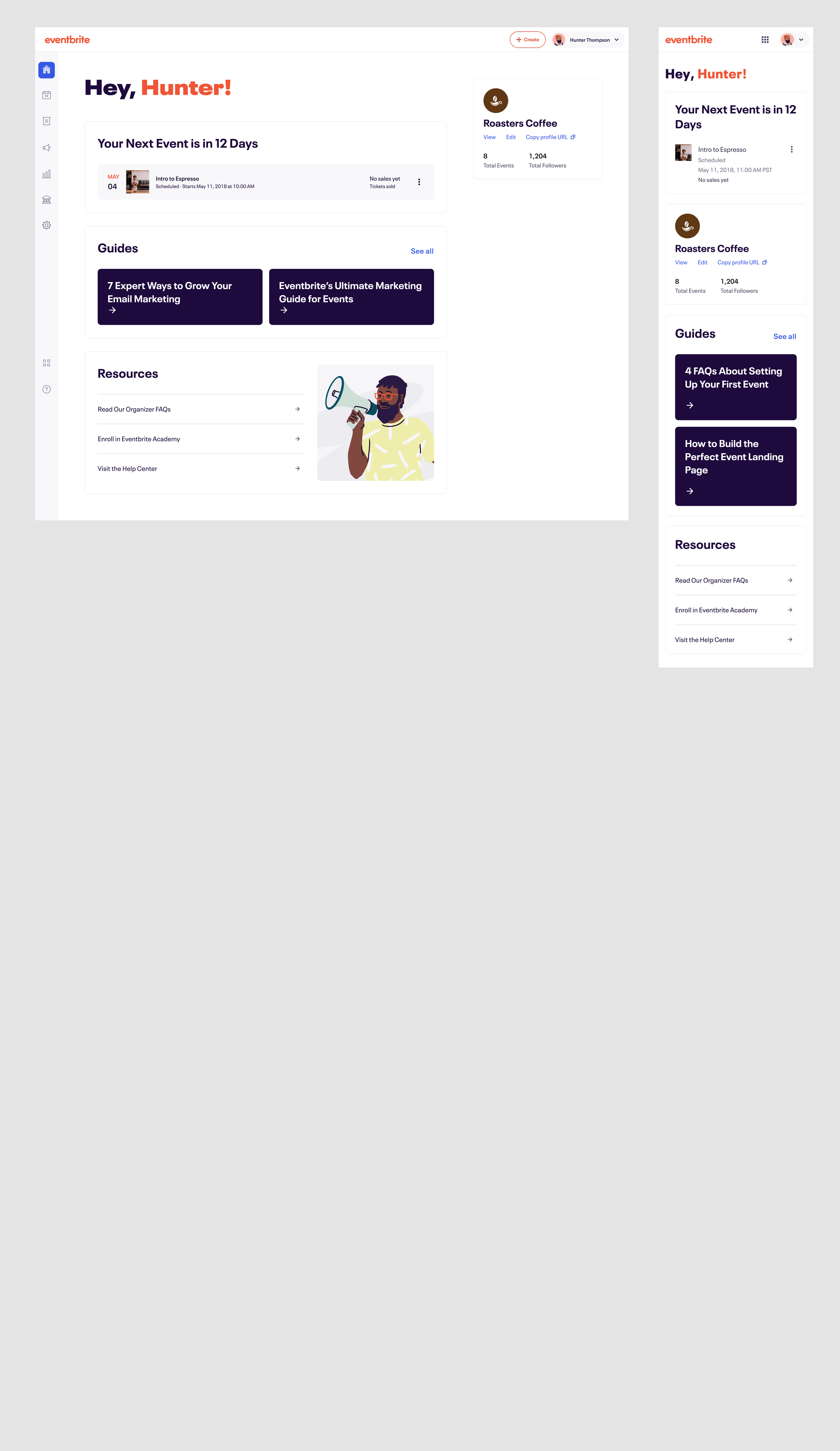
Knowing the culprit was most likely the overloaded checklist. I came up with a quick fix to use while we continued to design out our next iteration of Creator Home. The checklist was reduced down to the original 3 tasks. Marketing was given space to speak about Boost offerings in a module in the main body of the page as well as a tile on the right rail. To further emphasize Boost, we leveraged the appropriate timing of immediately after a Creator had launched an event to surface a celebrtion message with a CTA to explore marketing.
The Update
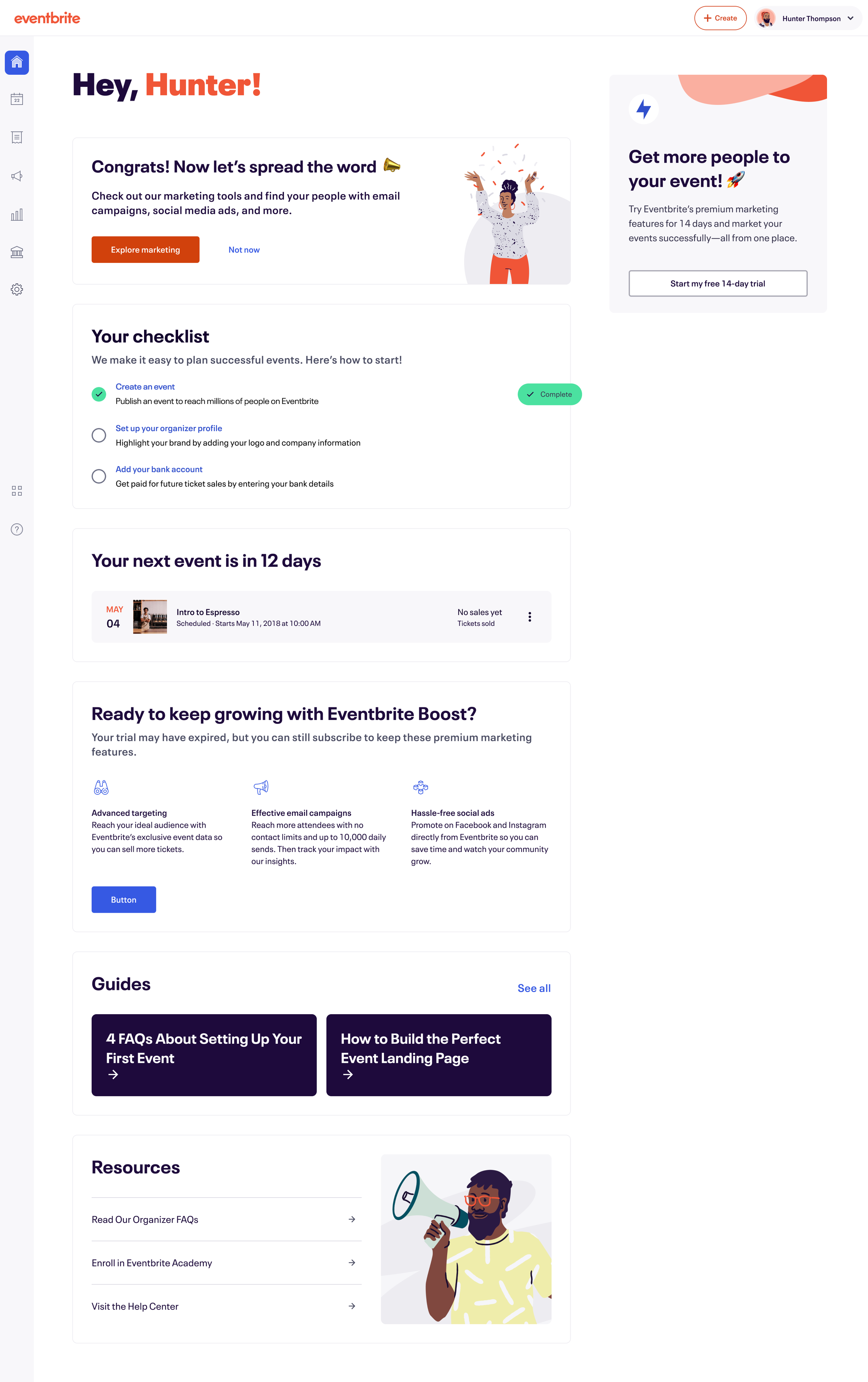
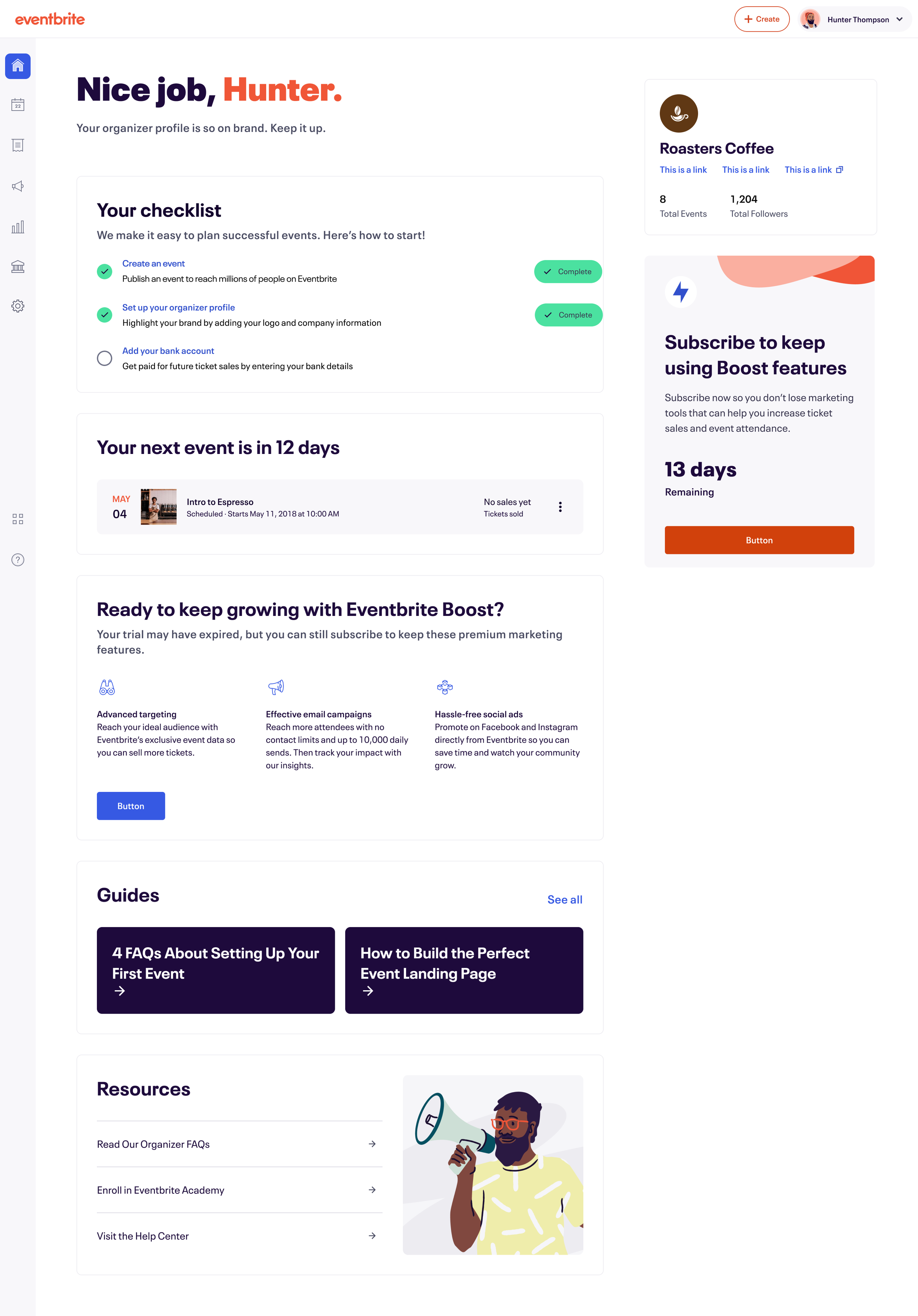
Epilogue: Creator home v.2
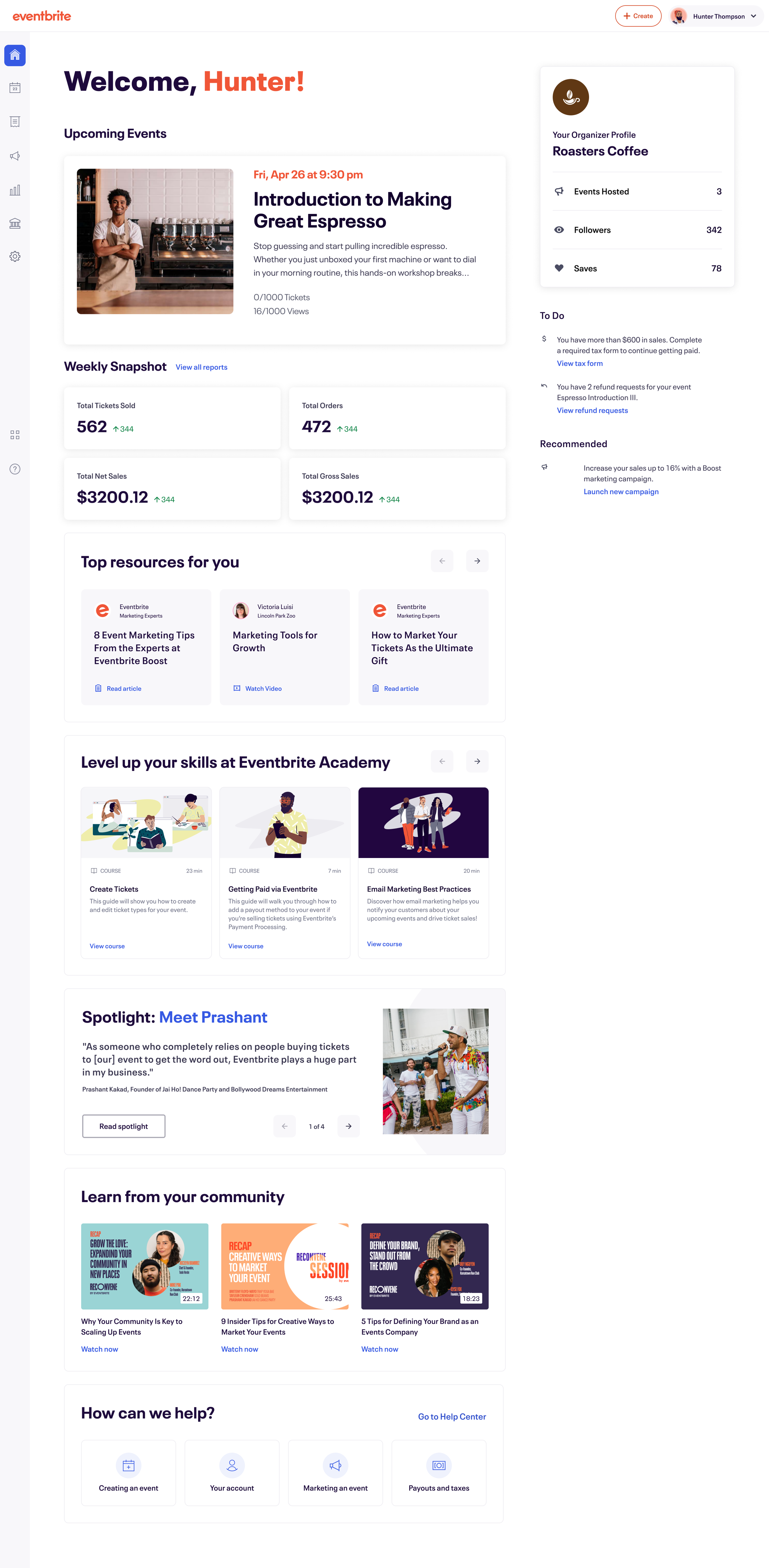
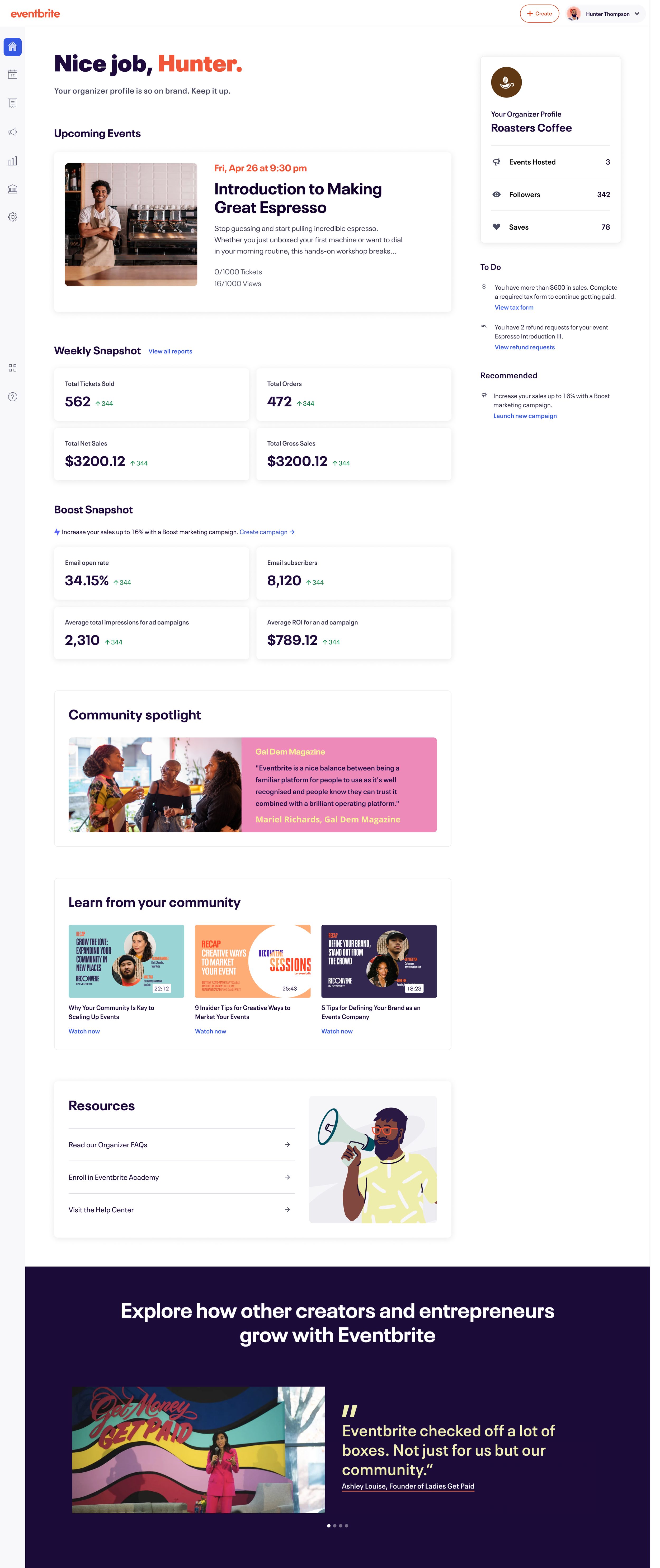
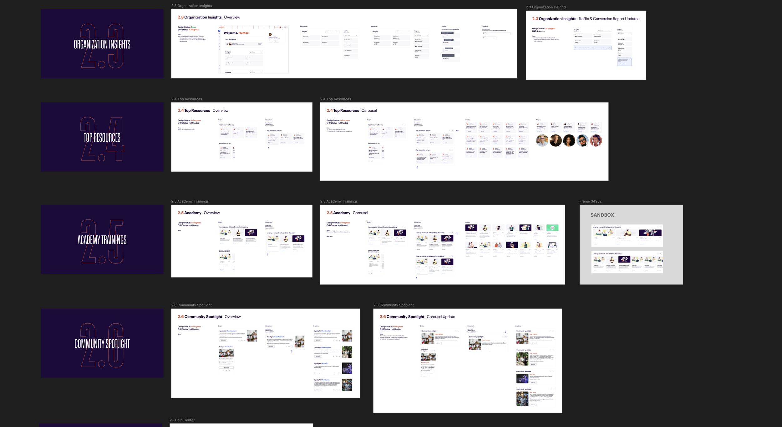
Before the timeline crunch that resulted in our checklist pivot, many rich and more expressive ideas had been explored. The vision was to have the body of the page dynamic, and reflect content that was relevant to the user based on information they had shared with us (for example, links to learning the ropes on Eventbrite Academy for new Creators or articles for more seasoned organizers on how to optimize their marketing campaigns. With the launch of the streamlined checklist, we now had some breathing to more fully realize this direction. Below are the Creator Home designs I finished before leaving the company, slated for release after I left.
The Impact
The updated layout successfully combined the winning streamlined checklist with a few personalized modules for later. By cutting out the stakeholder noise and focusing purely on what users actually needed to do, the new design unlocked the exact momentum the business was looking for. It proved that sometimes the best user guidance is just getting out of the way and keeping things incredibly simple. In the end we saw…
Boost Subscription Adoptions: +30%
First Paid Event Publication Velocity: +18%
Team Velocity: Replaced reactive design handoffs with an engineering-forward, system-driven workflow.
Earn Every Step
Prove the value of each interaction before asking for more data, ensuring every screen feels like an exchange rather than a chore.